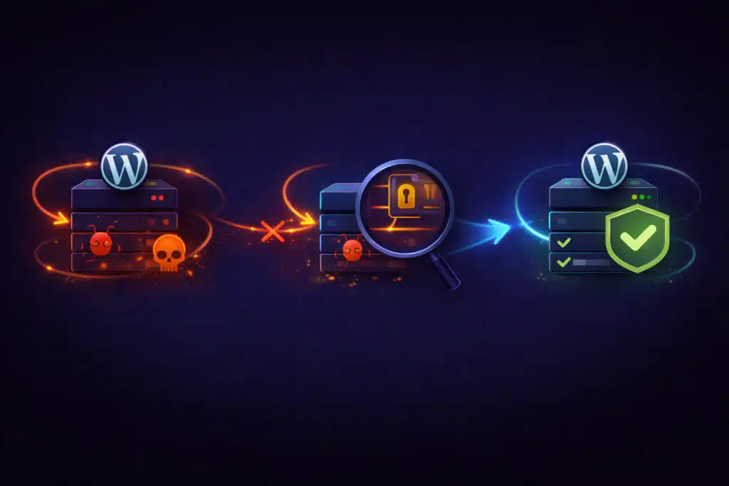
January 21, 2026If malware keeps returning after cleanup, the root cause was never removed. Learn what’s really happening.
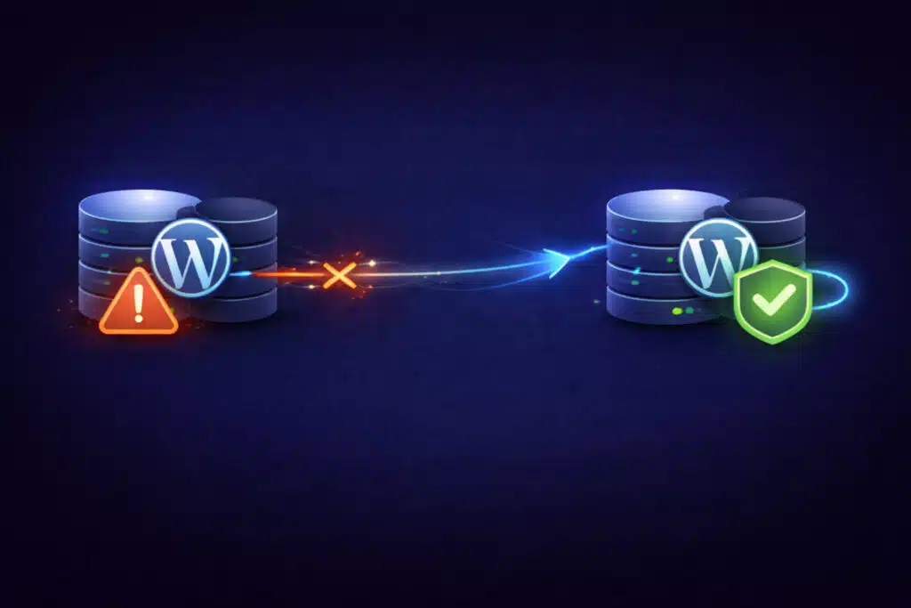
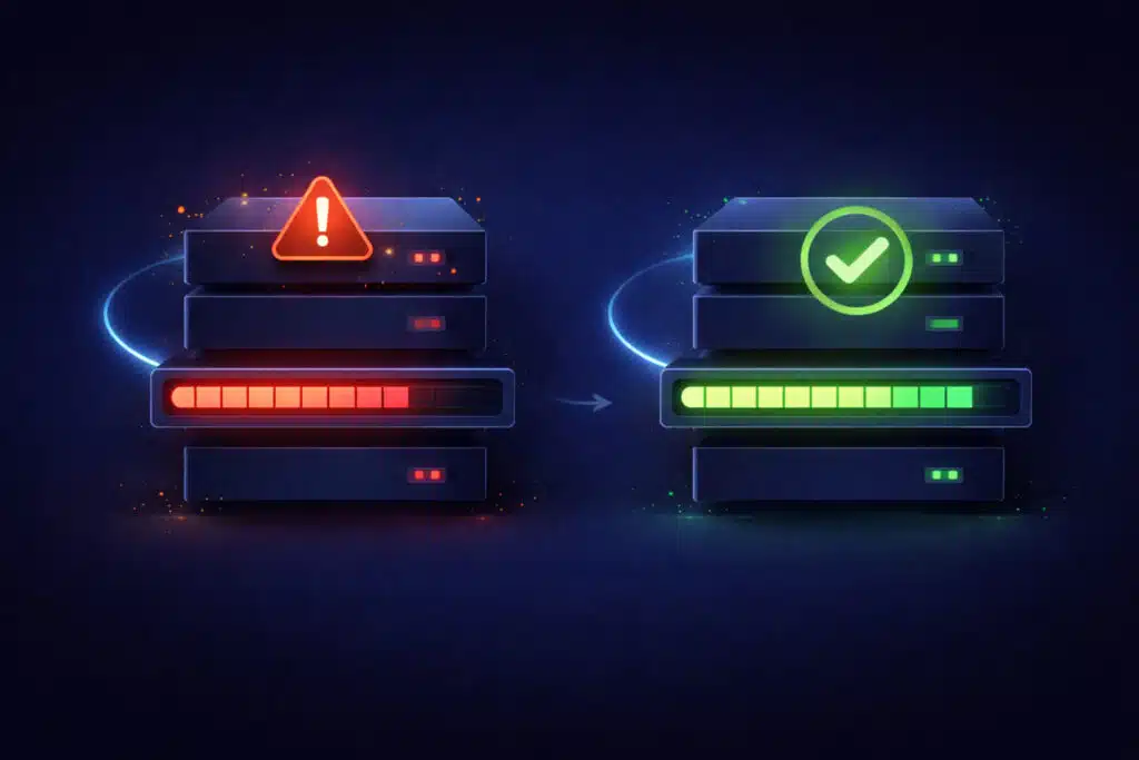
- January 21, 2026The database connection error in WordPress has several root causes. Learn how to diagnose and fix it properly.
- January 21, 2026Hosting migrations often break WordPress sites due to environment differences. Learn how to recover safely.
- January 21, 2026If your site was hacked after an update, the update likely exposed existing vulnerabilities. Learn what really happened.
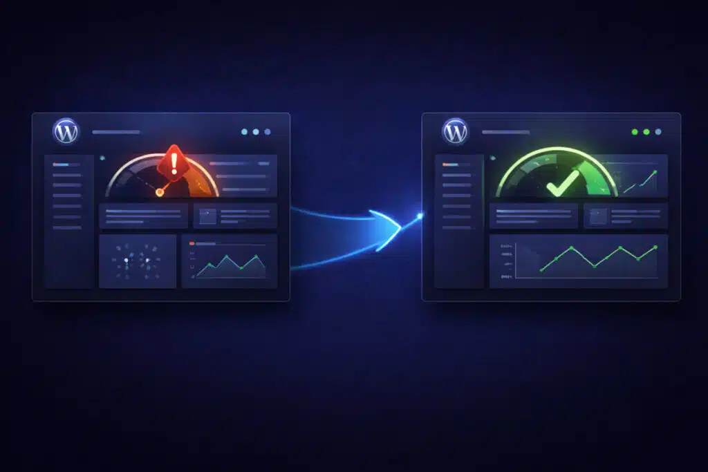
- January 21, 2026A slow WordPress admin dashboard usually points to deeper performance or plugin issues. Learn how to diagnose it.
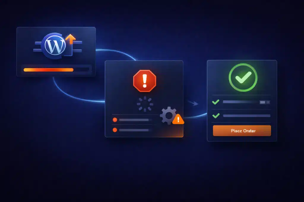
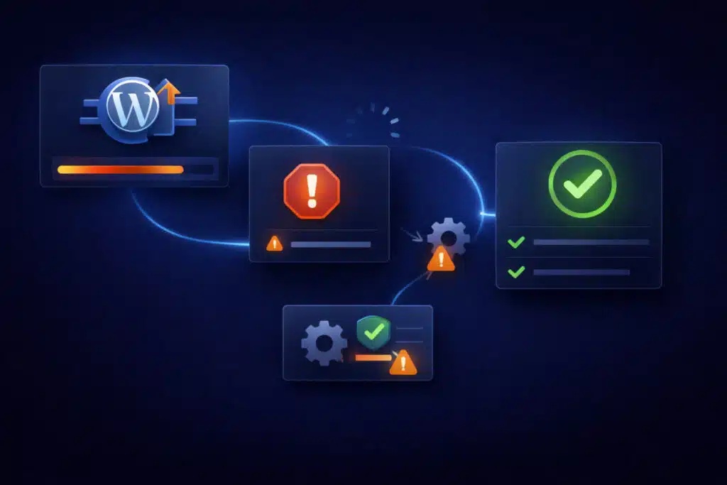
- January 21, 2026A failed WordPress core update can lock your site. Learn how to recover safely without data loss.
- January 21, 2026The WordPress memory exhausted error is often misunderstood. Learn what actually causes it and how to fix it correctly.
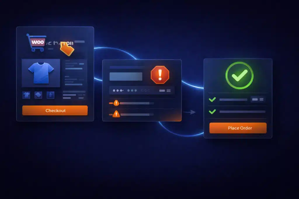
- January 21, 2026Checkout failures after WooCommerce updates are common and costly. Learn how to diagnose and fix them safely.
- January 21, 2026A plugin update can instantly take a WordPress site offline. Learn the real causes and the safest recovery path.
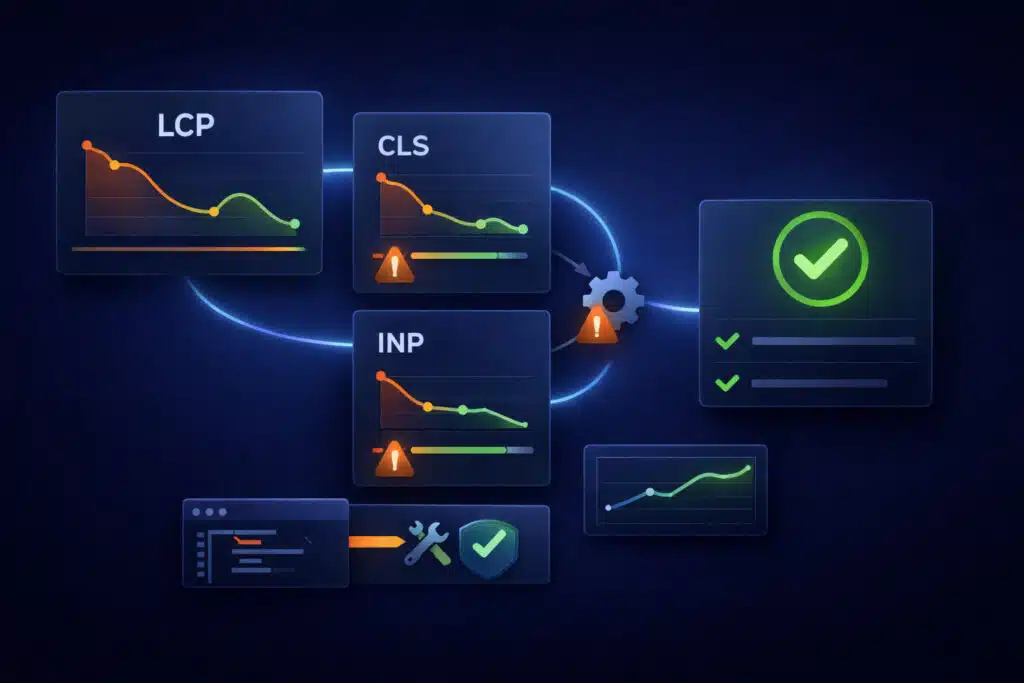
- January 21, 2026WP Rocket helps, but it can’t fix theme bloat, render-blocking assets, or real LCP/CLS/INP bottlenecks. Learn what’s actually failing and…
 WordPress • WooCommerce • Shopify